 Including monster statistics – stat blocks – in adventures is a challenge. The earliest adventures – the Giant adventures by Gary Gygax – listed the name of the monster and its hit points and nothing else. It’s a little hard to tell if this was an aesthetic choice or one born from the fact that the rules were still somewhat in flux (the AD&D Monster Manual was out, but the adventures had been written for original D&D). The advantage of this format is that the text isn’t interrupted by a lot of extraneous text. This makes the adventure easier to read and prepare, but more difficult to run. An even shorter variant leaves out the hit points – this is the way that Wizards does it in their current adventures, with (potentially) the full monster descriptions appearing in the back of the book or in the Monster Manual.

Hill Giant stats from G1: Steading of the Hill Giant Chief, the first (official) AD&D adventure module, published in 1979.
There’s another article that will look at how the choice of formats affects adventure layout, usability and readability, but for now I’m going to look at the major variations of D&D stat blocks through the ages.
During AD&D and Basic D&D, stat blocks typically included enough details that you could run the monster without referring to the rulebook, except in the case of special abilities. This was simpler because of how Hit Dice worked: attacks and saves were directly tied to the monster’s Hit Dice or Level, and DMs would typically refer to the DM Screen.
NPC stats and those of monsters with special abilities might get a little longer, but you’d rarely get a full description of a special ability; instead just a reminder that it existed. You’d have to look up the monster in the rulebook for a full description.

Pit Viper stats from B4: The Lost City, published in 1982.
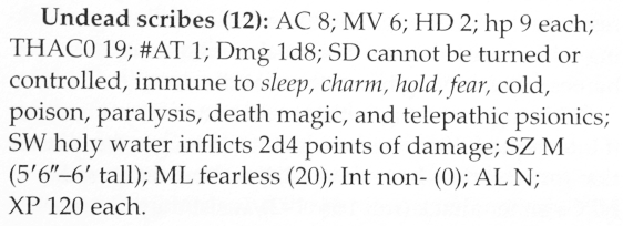
Undead Scribe stats from Die Vecna Die! published in 2000.
Between these two stat blocks, not all that much has changed. The late 2E block is slightly more complete, including Intelligence and Size, but you can see the similarities. The late-2E form of the stat block was then used as the basis for the 3E block. However, 3E had more statistics.
This meant that the stat block got longer. A lot longer. The advantage of this stat-block was its completeness. Compared to what came later, it also wasn’t so space-hungry, but it still wasn’t that short. As an aside, having to include Saving Throw modifiers, Skills and Ability Scores really does add a lot of text to each stat block.
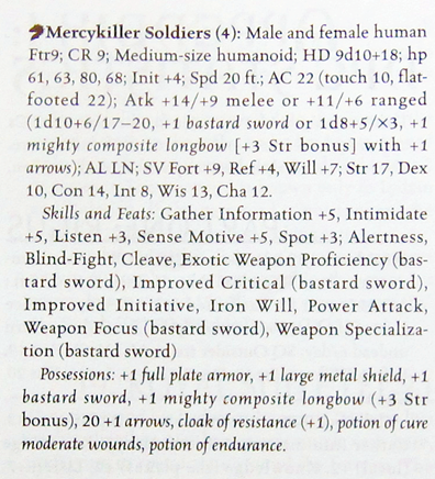
Mercykiller Soldiers, from Lord of the Iron Fortress, published in 2001. This is actually one of the shorter stat-blocks in this adventure!
Although the 3E stat block was longer than that of AD&D, it was fairly compressed and hard to read in play. Thus, during the 3.5E years, Paizo and Wizards developed a clearer version of the stat block. Which was incredibly space-hungry, but did split up the stats so that it was a lot easier to find relevant information.
One of the bigger problems of these stat-blocks is that they’d often include a lot of information that wasn’t actually needed during play. Do I need to know the monster has a “Keen Sight” ability that adds 4 to its Perception skill checks? Not when that’s already included in Perception! But 3E was the era of tinkering with monsters according to the rules, so Paizo tended to include a lot of detail. As I recall, the end boss Kyuss in the Age of Worms campaign took two-and-a-half pages to cover. Yes, that’s just a little too much space for my liking.
The format saw some adjustment from product to product. Here’s an example of a late-3.5E stat block from Wizards. You’ll note that it now divides the stats into various sections: basic information, defensive information, offensive options, and then attributes, feats and skills. This format made it much easier to find various abilities, at the cost of slightly more space.
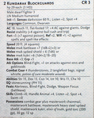
Kundarak Blockguards, from Eyes of the Lich Queen, published in 2007.
The 4E stat block took the late 3.5E stat block as a base, and slimmed it down. The biggest change was in the nature of attack powers in this edition. A monster having a +5 bonus to hit and dealing 1d8+2 damage was unusual – most attack powers were far more complicated. So, they consequently took up more space on the page. On the other hand, the 4E designers didn’t want long stat-blocks, so monsters just weren’t as complicated.
Another major design consideration in 4E was that they wanted to have as few references to other books as possible. If you examine the 3.5E block above, you’ll see Combat Gear, Feats and Special Abilities that aren’t explained. This changed drastically in 4E monster design, and especially as 4E monsters didn’t use spells as we understand them. Instead their abilities were included in full; there wasn’t the option of just listing “magic missile.” This reaction is entirely understandable, as it was getting harder and harder to “just run” 3.5E stat blocks, but the simplification probably went a bit too far – some spell-casting monsters really lost versatility as a result.
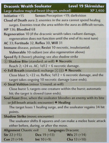
Draconic Wraith Souleater, from P3: Assault on Nightwyrm Fortress, published in 2009. I may have chosen a Shawn Merwin adventure not entirely at random, although it’s not his strongest.
Another, more subtle change of this edition was that there was no difference between a 4E stat block and a 4E monster manual entry. This was a very significant change: the Monster Manual entry was now a stat-block, and is something that 5E uses as well.
5E monster design restored spells (and a central spell list) to monsters, allowing more variety, and the Monster Manual monster entries draw very clearly on the late 3.5E and 4E versions of the stat block. Of course, Wizards doesn’t actually provide these stats in-line in the adventure! Instead, a line will reference 5 goblins, with the monster reference being drawn out in bold text; you’d then go either to the appendix or the Monster Manual to find out the stat blocks. No hit points are given (unlike G1), mainly because of the standardized hit points for most monsters.
So, in theory we have a stat block that takes up a moderate amount of space on the page and is pretty clear to read, but most Wizards’ adventures don’t use in-line stat blocks.
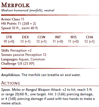
The Merfolk stat-block from the D&D Basic Rules – it’s one of the shorter blocks, in fact!
However, just because official 5E products do one thing doesn’t mean that third-party publishers need to do the same. We’ve seen a lot of various versions of shortened stat-blocks (the better to have on the page), as well as publishers having stats in the back of the book. Necromancer Games spent quite a bit of time debating the issue after its first Quests of Doom adventure compilation – and yes, I had some input here – so the Quests of Doom 2 book uses a stat-block which is a hybrid of AD&D and early 3E versions: most of the information you’ll need is in the stat-block, with reminders of more complicated abilities, although you’ll need to look at the full monster entry to see what those do. The stat blocks appear in the encounter descriptions.

– the Necromancer Games format
When I’m writing adventures for my home game (yes, I do have a game that isn’t a D&D Adventurers League game!), I tend to use a shortened stat-block in the text. Here’s a couple of stat block from the last session I ran:
Grotesque Golem: AC 11, hp 120, 2 slams +6 (2d10+6 plus weakness DC 16), magic resistance, golem immunities, immune non-magic weapons, Str +6, Con +5. CR 5.
Horrible Machine: AC 18, hp 170, blade +7 (3d10+5), resists weapons.
I tend to assume any ability score not listed is +0 (even if it isn’t, if it is close I like saving space). Or make something up on the spot… the Horrible Machine would require a longer block if I was intending the adventure to be published!
The purpose of including a monster stat-block in the text is to simplify the job of the DM: they can run the encounter without needing to reference an appendix or another book. However, it has implications on how the adventure is written, which I’ll deal with that in a future article.
Meanwhile, in Pathfinder-land, they use a combination of monster references (for common monsters) and in-line stat-blocks for unique monsters, with their stat-block format being a variation of the late-3.5E format they developed. There’s not just one way of doing things!

I’ve been thinking about this a lot lately as I’m working on a couple of adventures for publication. Looking forward to the follow up article 😃
Been reading your blog for a little while now, really enjoy your reviews. Anyway, I’ve been writing my own module and you bring up a very good point here. As of the draft right now I copied the bold format of the official adventures, mostly because I wanted to maintain a professional looking format but also because I hadn’t quite considered this problem. It’s obvious now in hindsight, even in my testing I had to quickly run through the MM to get to the monsters I was using.
For 5th edition I wonder if you could get away with a similar format to Necromancer Games, but once you start introducing monsters with special abilities it starts eating up space a bit. It’s a tricky problem.
It really, really is. I’ll have another article soon which looks at the the influence of stat blocks on adventure design, and discusses how to handle it depending on the style of adventure you’re writing.
Finished DMing Hoards and cant tell you how much I hate having to cross reference for stat blocks during the game. Slows me down and breaks up play for the gamers. In later sessions i printed out the blocks i needed and inserted them at the pages of the adventure.
Bring back 3.5 style blocks and spend less pages on fluff so overall page count stays about the same.
As a default, I like the 5e stat blocks. They are relatively easy to navigate, they make good use of font sizing and emphasis to help readability. They even make good use of the lines to break out sections. While the fonts they use are all “pay-for”, the format is reasonable to replicate as done in the Dan Coleman series.
Looking at the Alea Publishing format, I think their layout is even cleaner with first-line outdents on Traits and Actions making them easier to read. They also place CR / XP in a little block with the monster name, which is also much cleaner.
I really like the premise of a shorthand format (like Necromancer), but that really has some readability concerns to me. If you’re going to shorten the stats, why even detail them? Just say something like “Stats +1 +2 +1 -4 +1 -2” or possibly “Stats 1 | 2 | 1 | (4) | 1 | (2)”. I mean, the order is always the same, why even put the abbreviations?
Frankly, if there’s a spot where 5e stat blocks really need work, it’s their alignment and use of space. For example, stats always get a whole row across, but the number you’re looking for is “right then down then right again” which is awkward. Plus, when you’re looking for an ability score it’s usually because you’re rolling a Save or Skill Check. Except the save is above the line in the “Defenses” block and the Skills are below the line, but only if they exist. So every time you roll a Save or a Skill check, you have to look at two different places and cross that visual line. If these things were all in one line, it would be much easier to read & use.
Likewise, “Armor Class”, “Hit Points” and “Speed” are always the first three lines of a monster block and they all have different word lengths and alignments. There’s all of this white space to the right, but they haven’t bothered to use this to line up the numbers which would be easier to read. The same is true of the third section: “Skills”, “Senses”, etc.
Of course, if your creature has a bunch of Resistances & Immunities (take a look at Flameskull), the DM is faced with a multi-line, comma-separated list of “things” that are relevant. But it’s a block of text and also hard to read.
One other conceit made by the 5E stat block is the lack of symbols. Everything is text. If you want to translate a stat block to French, I’m sure it’s pretty straightforward and the text just “reflows”, but it’s equally hard to read. Some use of symbols and layout would serve to make this more compact and language-agnostic. Of course, it’s easy to go overboard with symbols, but it would be fun to experiment with at least a few.
If you really wanted to make a nice compact stat block, I think symbols and good table layouts would really do the trick.